
"writing about music is like dancing about architecture"
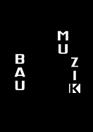
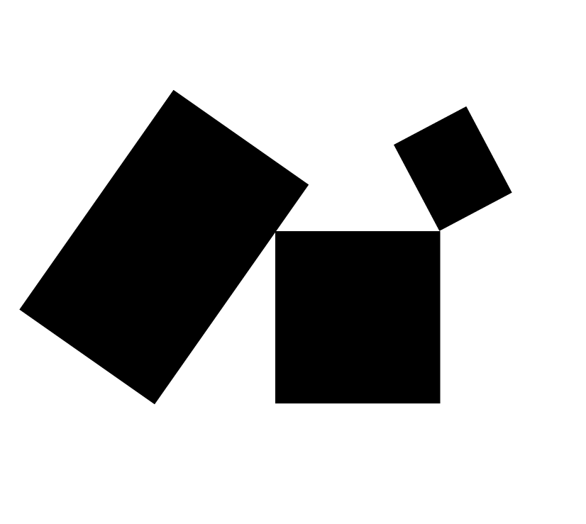
Bau Muzik preliminary Logo conceptions v.1
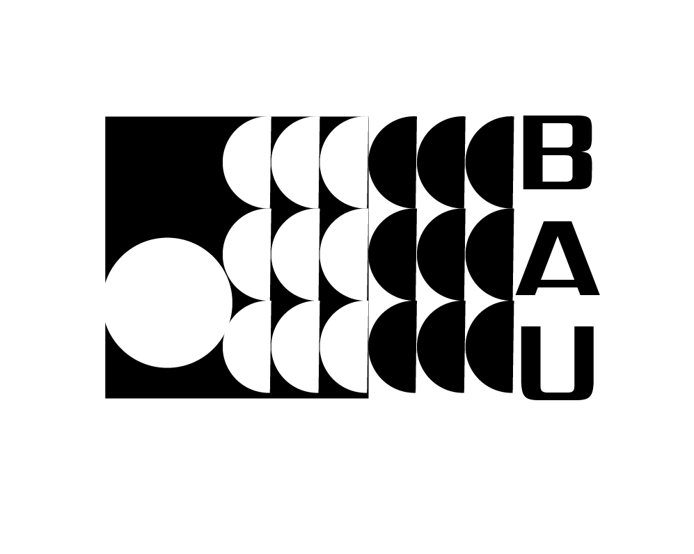
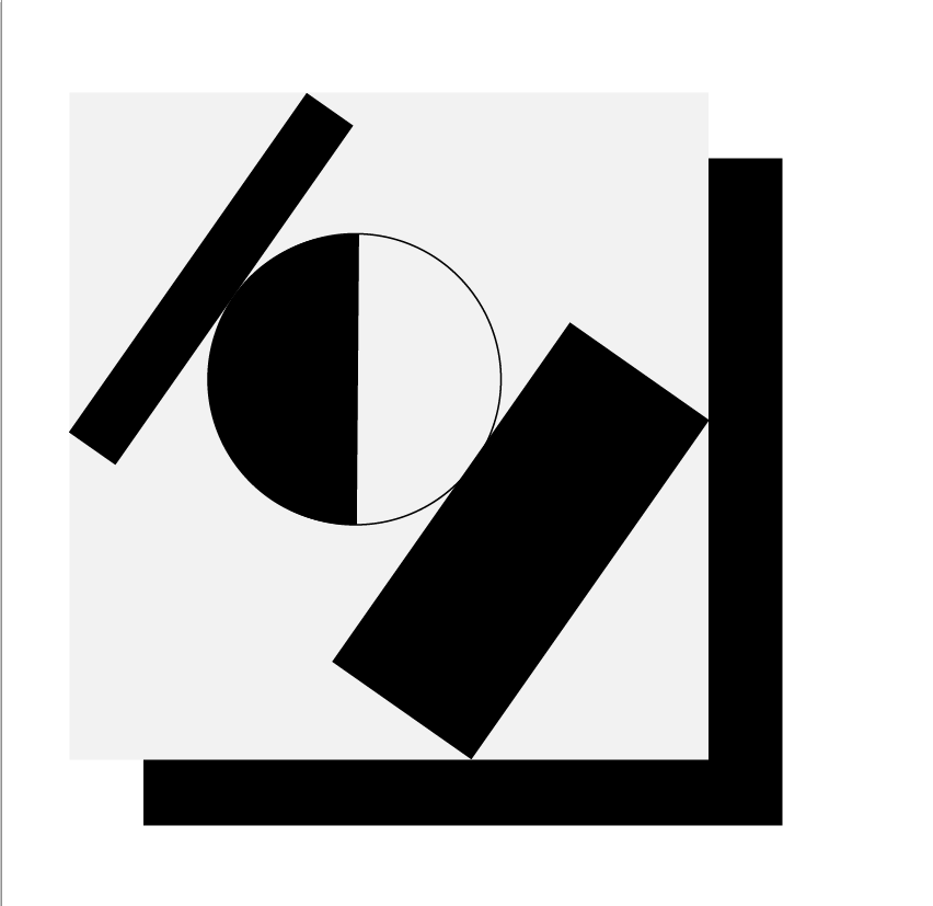
Bau Muzik preliminary Logo conceptions v.2
Bau Muzik preliminary Logo conceptions v.3
Bau Muzik preliminary Logo conceptions v.4
concept/story
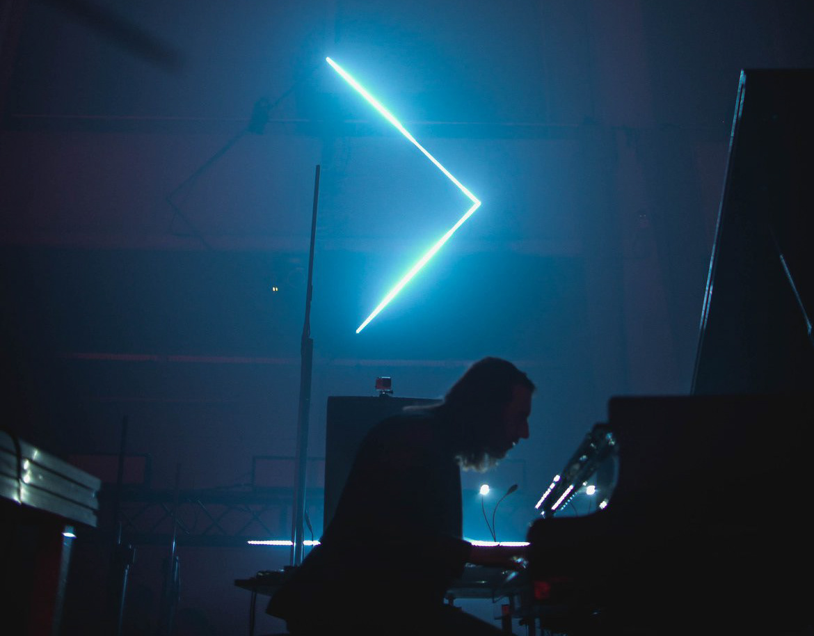
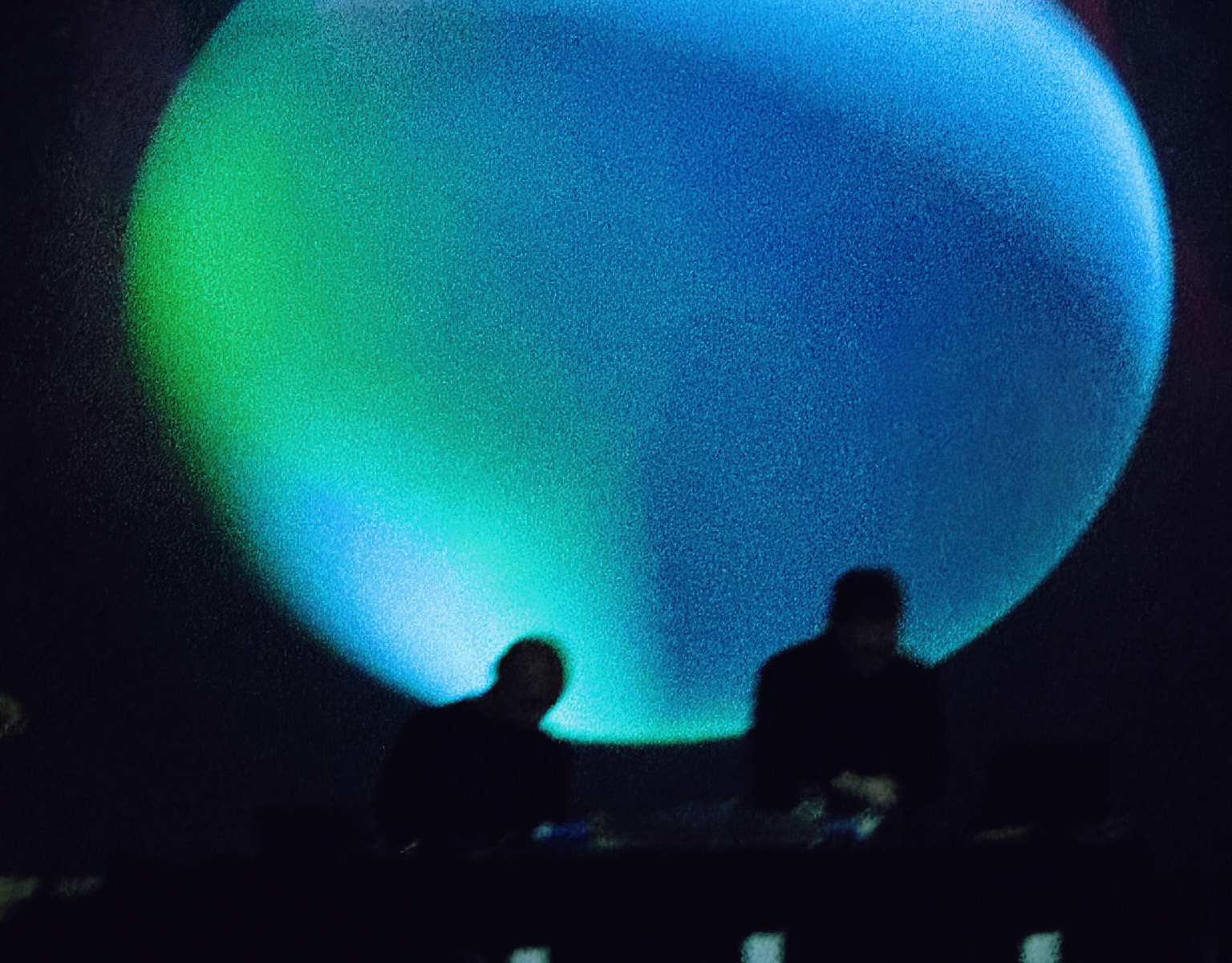
The label's concept is a complete work: focusing not only on music, but also on art.
This interdisciplinarity has a dimension in the quality of music it will offer in Bau Muzik's signature releases, as well as in its graphic aesthetics. In the future, they will also include a set of specially designed animations/visualizations. Indeed, the idea for the label's graphic identity has its roots in pre-war art and architecture - it is inspired by the Weimar school of architecture and design, or one of the factions of modernism - the Bauhaus style. The simplicity, functionalism and minimalism that characterize the Bauhaus - were the main guidelines for the design of the DEAS logo and label.
The font was designed by Tomek Gawronski [Tving Stage Design] together with Karol Mozgawa [Deas].
"The Bauhaus idea was something that has long corresponded strongly with techno music in my personal opinion. Art not just for art's sake, but fulfilling the aspect of usefulness, these are ideals that overexpose the origins of the Weimar school of design and are, in my opinion, identical to the techno philosophy. I am very happy that in cooperation with Tom Gawronski we managed to create also graphically a very coherent and interesting project."
Deas

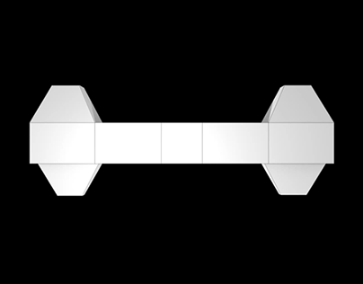
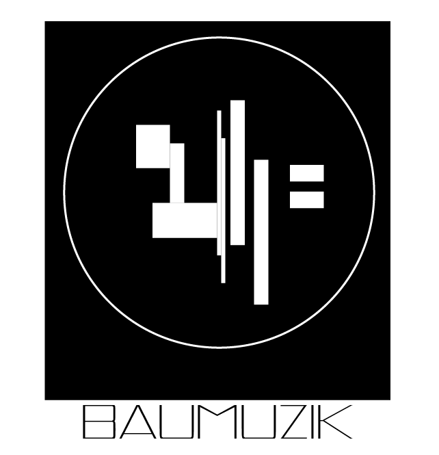
Final design of BAU MUZIK logo
credits:
Concept/design by: Tving Stage Design
Client: Deas [Karol Mozgawa]
Released: 2020

on the web
muno
electronic beats poland

DEAS social media links